网格布局
什么是网格布局
讲到布局,我们就会想到 flex 布局,但 grid 布局更加强大。flex 布局是一维布局,Grid 布局是二维布局。flex 布局一次只能处理一个维度上的元素布局,一行或者一列。Grid 布局是将容器划分成了“行”和“列”,产生了一个个的网格,我们可以将网格元素放在与这些行和列相关的位置上,从而达到我们布局的目的。
创建一个 Grid 容器
1 | .box { |
容器属性介绍
grid-template-columns、grid-template-rows
grid-template-columns 属性设置列宽,grid-template-rows 属性设置行高,这两个属性在 Grid 布局中尤为重要,它们的值是有多种多样的,而且它们的设置是比较相似的,下面针对 grid-template-columns 属性进行讲解。
1 | .wrapper { |
repeat()
repeat() 函数可以简化重复的值。该函数接受两个参数,第一个参数是重复的次数,第二个参数是所要重复的值。
1 | .wrapper { |
auto-fill
auto-fill 关键字表示自动填充,让一行(或者一列)中尽可能的容纳更多的单元格。
1 | .wrapper { |
fr
fr 是网格布局中的一种单位,代表网格容器中可用空间的一等份。
1 | .wrapper { |
minmax()
minmax() 函数产生一个长度范围,表示长度就在这个范围之中都可以应用到网格项目中。它接受两个参数,分别为最小值和最大值。
1 | .wrapper { |
auto
auto 关键字表示长度自适应。
1 | .wrapper { |
grid-template、grid-area
grid-template 允许我们自定义网格容器中行列的布局,如跨行或跨列。
假设我们要实现以下布局:
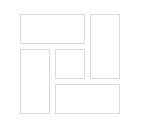
可以看到该容器既跨行也跨列,与一般的网格布局不同。
因其内部共有五个子元素,所以 html 为:
1 | <div class="grid-container"> |
接下来是样式。在跨行和跨列之前它实际上是一个 3×3 布局,之后再借助 grid-template 使其行列融合。
1 | .grid-container { |
grid-template 中的字母可以随便定义,只要相同便会融为同一行或同一列。
现在布局定义完成了,但需要子元素一一对应上去,这就需要用到 grid-area。
1 | .grid-item { |
grid-row-gap、grid-column-gap、grid-gap
grid-row-gap 属性、grid-column-gap 属性分别设置行间距和列间距。grid-gap 属性是两者的简写形式。
grid-auto-flow
grid-auto-flow 属性控制着自动布局算法怎样运作,精确指定在网格中被自动布局的元素怎样排列。默认值为 row,表示放置顺序是”先行后列”,为 column 表示“先列后行”。
若在排列时由于长度原因导致有空白,可以设置 grid-auto-flow: row dense,表示尽可能填满表格。
justify-items、align-items
justify-items 属性设置单元格内容的水平位置(左中右),align-items 属性设置单元格的垂直位置(上中下)。
1 | justify-items: start | end | center | stretch; |